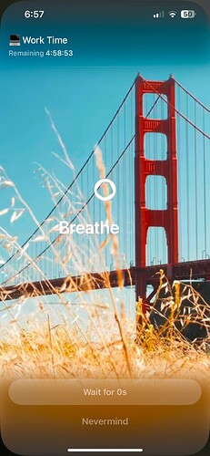
I don’t like the new waiting animation. Could you make the option to turn it off in the settings menu maybe?
Hi guys, just a simple suggestion:
When you want to unblock you see the “take time to reflect” visual, but quite quickly this changes to a visual stating “almost there”. This last visual is quite motivating to wait because why not wait if you are almost there. Why not keep the “time to reflec” visual till you can unblock?
Hey @Peds,
Thanks for the feedback on our new waiting screens. I’ve passed these suggestions along to our engineers to consider as we continue to upgrade the app. Stay tuned!
All the best,
Team Opal
that’s a great suggestion, I think we’ll be able to do that very soon
Dear Opal Team,
I really like your app. Even paid for the full version. But! the new design is totally not focusing on the goal of the app.
-
There is an animated loading bar, making me much more likely to wait for the time to pass by. Not the idea! I want to come to the conclusion I don’t want to snooze. In this way though, I get a visual incentive to wait.
-
Following on that. After some messages in the same loading screen it shows “Almost there”. Again, something to keep me there. I don’t get it.
In my opinion I really liked the old design. Just seconds passing by, nothing to look at. Much more in favor of the use case.
Please! make it possible, to individually set the block screen. Smth like a old design / new design switch.
I would be super happy, if you make this possible. Otherwise I am not sure if I am willing to pay for another year ![]()
Thank you so much in advance for reading so far.
Kind regards
Soeren
Hey @Peds,
Thanks for the feedback on our waiting rooms. I’ve escalated this to our engineers to consider, as we’ve been receiving more requests to do just this. Thanks for your patience, and stay tuned!
All the best,
Team Opal
Is there a way to change the time on or turn off the pause that happens before it opens the currently engaged app blocking? There are times when I’m out and need to quickly open up an app I keep blocked for when I’m home. The wait and “breathe in/out” reeeally gets on my nerves those days lol, and has kept me from keeping them blocked regularly, which isn’t helpful. This way I could separate apps like messages from general social media or games.
The videos that appear during the “Breath In” app prompt are really calming and nice to look at. I would love for it to be possible to just view the videos with extended playback without requesting a break from a blocking session.
I find the videos that have been selected for “breathe before open” to be very pleasant and calming and they seem to truly shift the speed at which my mind is going.
I suspect that if I were able to breathe with them for meaningfully longer than one breath (maybe a configurable amount?) they would be significantly more effective at deterring me from breaking out of or skipping a limit. With the current configuration, I typically just keep going on the breakout or skip…
Thanks,
Dan
Hey @Peds,
Thanks for your feedback on the breathe videos in our Waiting Room! We are currently working on improving this feature, but I’ve also merged both of your requests into a single thread so that other Gems can also contribute to your feedback and vote for it to be implemented. Stay tuned.
All the best,
Team Opal
Hey @Madison_Schwamb ,
I’m afraid it’s not currently to opt out of our Waiting Room/Breathe videos, but we appreciate the feedback! I’ve passed this suggestion along to our engineers to consider as we continue to upgrade the app, and merged your feedback into the existing thread on the topic. Stay tuned!
All the best,
Team Opal
I also dislike the waiting time screen. It’s so busy that I don’t feel like I’m waiting. I like the breath in and out animation, but I often am distracted by the background.
I’d like to customize the wait screen; personally I would like a minimal design with the most recent gem achieved guiding me through breathing in and out. Thanks, Opal.
