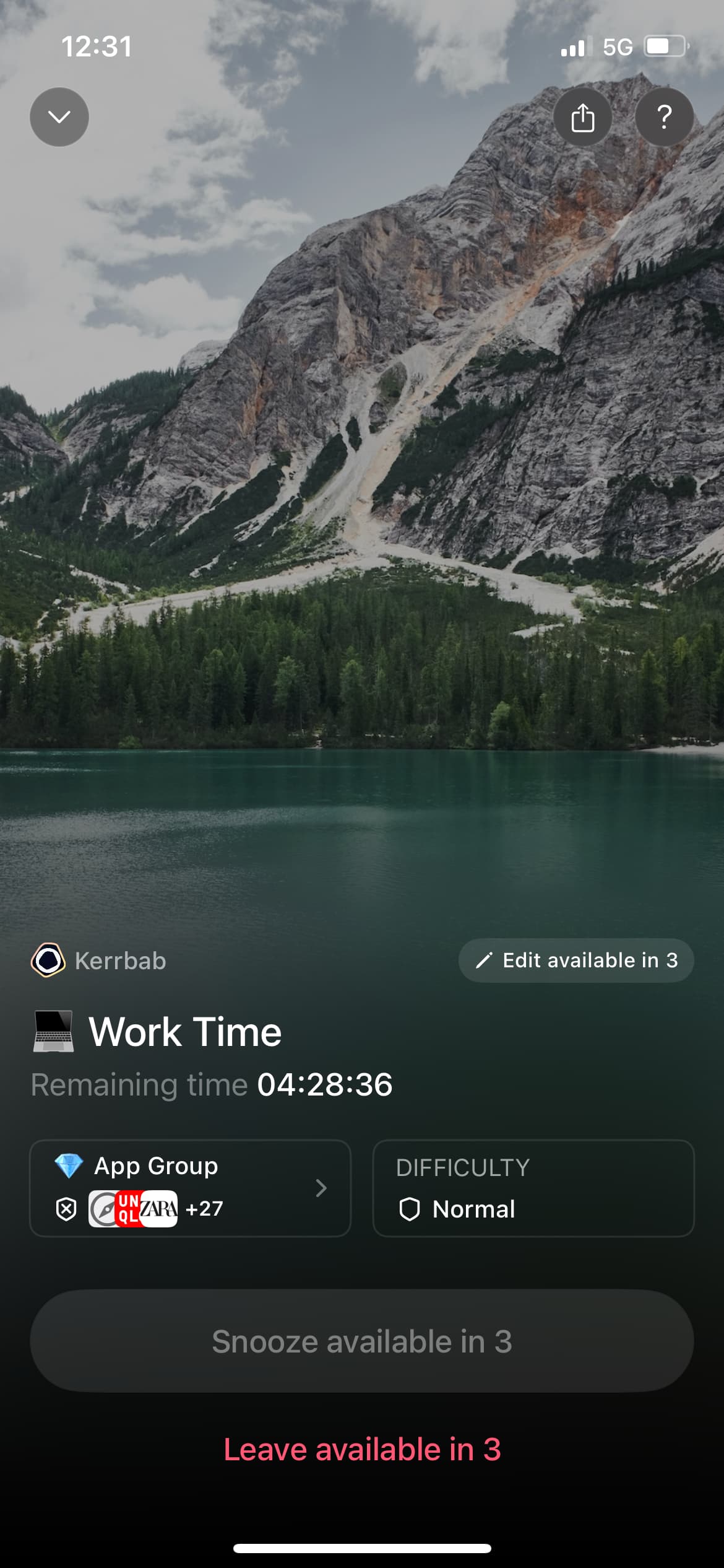
I think I am being AB tested new UI in the app. When I tap on my session at the bottom of the home page it opens a page which has the image of a mountain as the background. It used to just open an action sheet with options to manage the session.
Did anyone else see this? How do you feel about it?
I personally think it is at odds with the design of the rest of the app and it was jarring when I saw it. I’m not sure how it is relevant to the rest of the app design?!
Part of the reason I love opal is the design of the app and the gem colours and how that influences the colour of certain elements. The app is very beautiful really and calming, and I found the image of the mountain disrupted that.