Hi Opal Team,
I wanted to say that the recent UI updates of this app are actually making it worse to use. I find myself more irritated to interact with this app and to find my way around.
To take a break, to set a block. It’s all really unpleasant because of the interface. I’d really reconsider who is leading your UI / UX with this app. Start from scratch before you get too far down the pipeline,
I really like the power of this app, although I think it is overpriced by about 50% and would pay about $49.99 a year for it, The interface is frustrating enough to get me to stop what I was doing and leave a comment about it.
I hope this is helpful and would be interested to hear what others think.
Thank you.
Thanks for reaching out and for the thoughtful feedback on our UI. Is it possible to provide clearer/ comprehensive feedback about what is and isn’t working? Once I understand what you’re expecting, I’d be happy to pass your message along to our engineers and UI designers to consider as we continue to upgrade the app.
Hi Sarah, I’d be happy to do a walk through of the areas of friction. Can you suggest a feedback application that records the phone while I’m on the computer? I’m sure something like that exists.
Hi! I also came here to mention the UI and that I much prefer the previous version prior to the most recent update.
My main issue is that now instead of being able to see a breakdown of my screen time I instead only see all these suggestions of sessions to set up. I think having a separate tab for suggestions to improve your focused routine would be great and I’d be in support of that, but when I open the app I am going to it specifically to check my screen time and see what apps I have been using, which is now no longer available in the main home page. Usually when I am opening the app it is because I already have a scheduled session that just started and I like to use that opportunity to reflect on my screen time so far that day. I think it would be better to have a separate tab for suggestions of sessions to set up and possible routines instead of having the screen time breakdown not on the home page.
It is also a little bit confusing with regards to taking a break during a session or if I hit an app limit and do want to reset it. Previously both scheduled sessions and limits would display at the bottom on the home page, but now only sessions appear there, so I have to go to the next tab over to try to find the limit etc. - I have also had the issue where I accidentally start a session by clicking “add” on one of the suggested sessions when I am trying to look at my current session or take a break from that session.
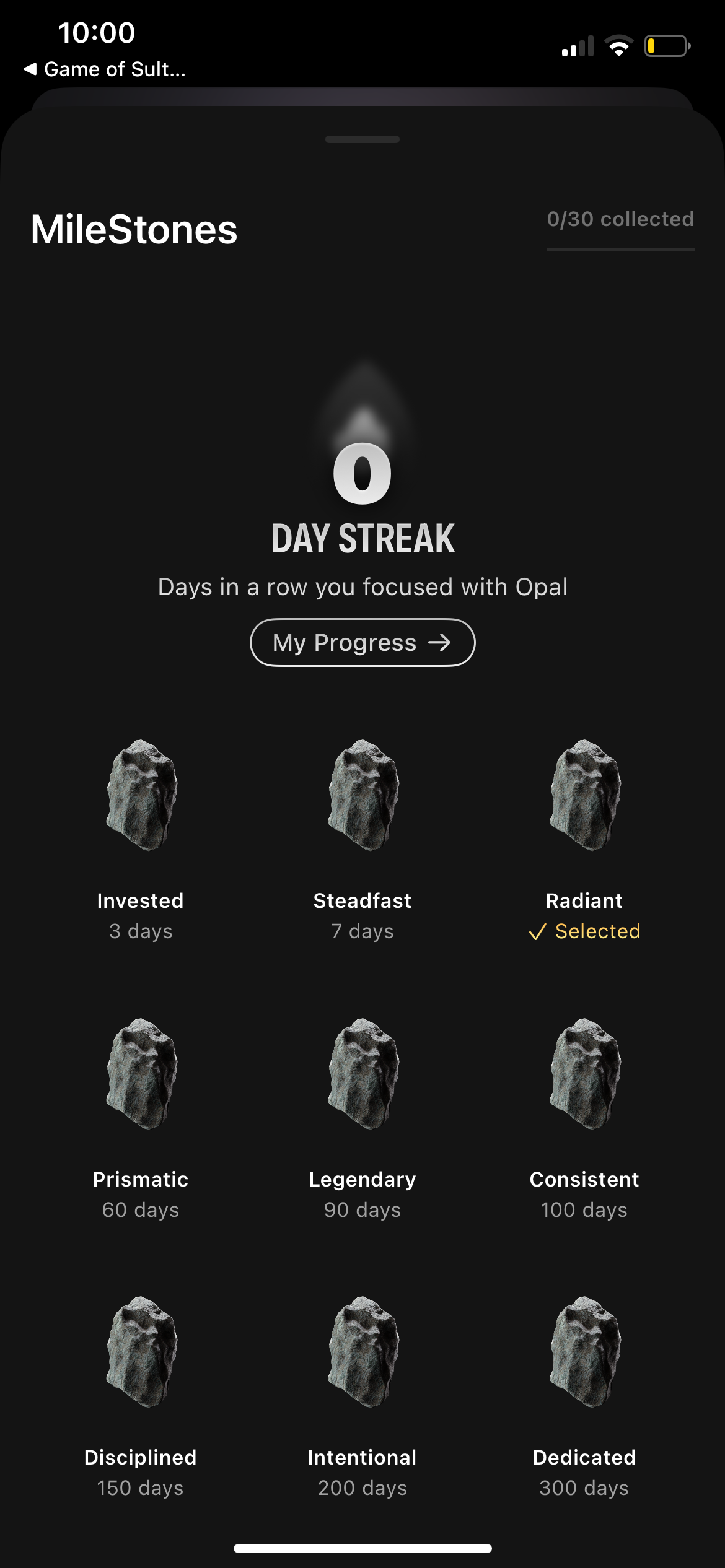
I have also noticed significant issues with the app no longer having registered my progress and therefore locking all of the gems I have unlocked over the years. Like I said, I’ve used this app every day and for a very long time and have unlocked most of the gems, and so it is very frustrating and weird for it to now reset my focus streak and make it so I can see any of my gems. I’ve provided a few screenshots of this to help visualize.
Thank you so much for taking the time to hear my feedback! Again super love this app and I hope that some changes can be make to make it more functional!
If they revert to the previous UI then I would totally recommend the app - it was really beautiful and intuitive but I am definitely not a fan of this update. I’ve used this app for about 2.5 years now and I really have liked it, so hopefully Opal sees the feedback and makes some changes!
Hey! thank you for mentioning this, we are constantly improving the design of the app (and sometimes, accidently making it worse). This feedback is super valuable as we are working on improving the home and navigation.
iOS? It natively has one. Pull down from the top right part of your screen and there should be a record screen button that looks like a circle. Don’t forget to trim out the parts that are meant to be private (i.e. your Home Screen and notifications)
I agree with this too. I’m a new user and honestly the app feels pretty hard to get used to right now, lots of little friction points that make me unsure if I’ll stick with it.
Big thanks to the founder for sharing the step-by-step guide I’ll try recording my screen with the mic on and send it over so the team can see where I’m getting stuck.